Jan 23, 2009
look: Ghost in the Shell 2.0. . .
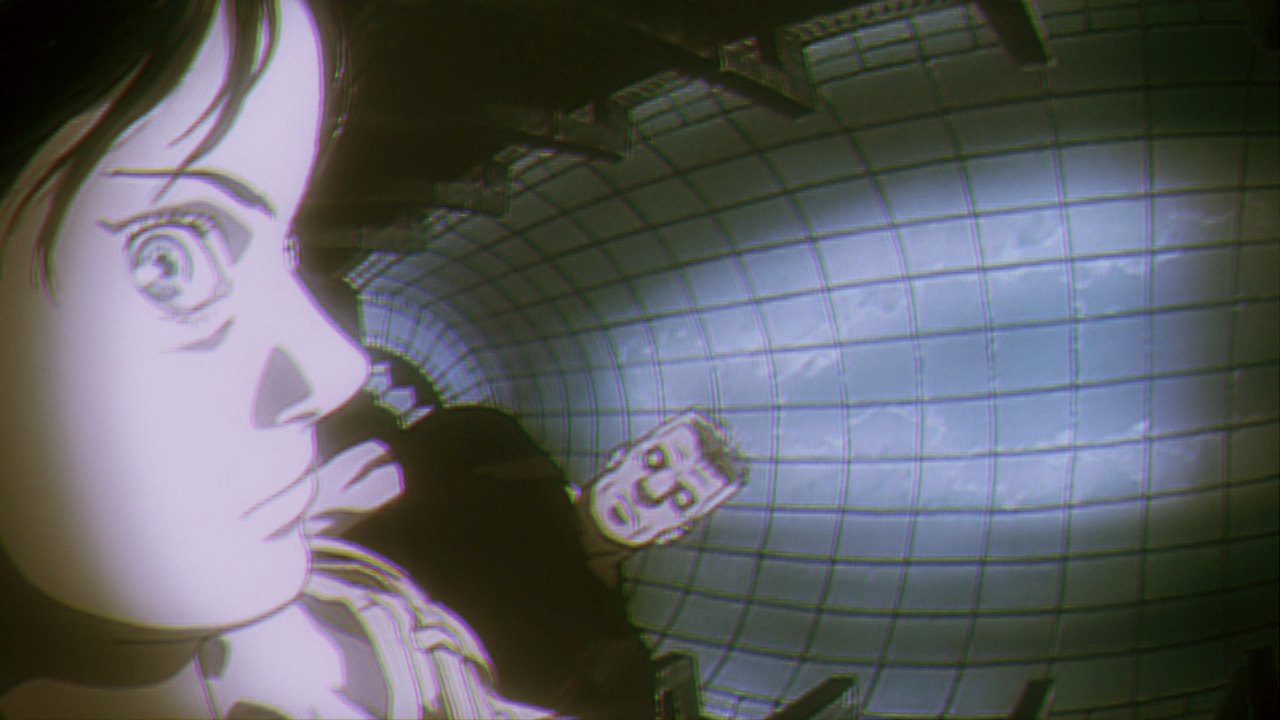
I just had the opportunity to check this out, and I must say I was very surprised to see something like this, and there are some things I definitely like and some things that just don’t quite fit. Still, going back to re-work something like this is quite an undertaking, and I have found that I really like some of the changes, the overall color scheme shift really does change the mood of certain parts of the film. And the new audio is absolutely phenomenal in most cases.
From what I have heard, the changes were mainly motivated by Oshii himself.
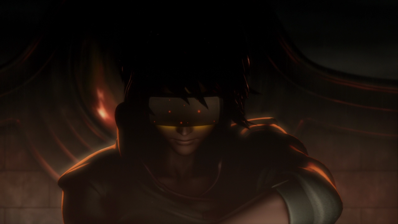
click to view full size
As an animator that absolutely loves both the original, the sequel, and the the series, I have to say I find some of the enhancements to be extremely well done. The only thing out of the entire thing that really bothers me is the recreation of Motoko in CG for the opening. It was done in a way that actually looks quite nice and it seems to make sense as an opening, but I definitely believe it would have looked better with enhancements on the compositing or re-done 2D animation (only the extended falling sequence would have had to be re-done) to better fit the new environments.
Something that is fantastic though, is how some of these changes have improved the cinematography, like many animated films of its time, Ghost in the Shell definitely suffered from the panning “moving” camera and immediate stop syndrome, having that alone taken better care of here is a great improvement for me.
And as far as the environments go, I am a huge fan of the Interface and Environmental stuff that was done in Innocence, so I find the change to the opening score sequence to be quite an improvement. Something about the orange that really gets me, and it really works well for this world.
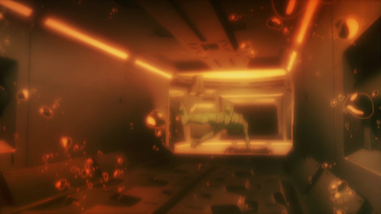
click to view full size
Something that always bothered me about the original audio was that all of the English voice actors, except for the Puppet Master, were kind of lame, while all the Japanese voice actors, except the Japanese Puppet Master, were fantastic. This version uses the Female voice actor who played Haraway (woman with short white hair) in Ghost in the Shell 2: Innocence. I think Project 2501 works a little bit better as a female actually, although maybe a certain type of distortion in the voice or something would have added a little more. But it definitely makes more sense to me to have this self-aware entity taking on a voice that actually suits its current shell.
Again, I think with a re-work of CG Motoko, you would have a truly excellent re-telling of this story, the animation is already there, it is just the look that is present in the rest of the film that is missing there.
If I get crazy enough, I may say copyright be damned and do everything I can to re-create those CG versions of Motoko in a well composited 2D handrawn form, with the new environments.
I now have a side-project that will always be in the back of my mind. . .what do you all think?
Everything aside though, I must admit that I am a little nerdy for this whole thing, I really love the new orange look, many of the changes make it a better film for me, but my reasoning is pretty biased and specific. I am interested in what other people think, I am sure a lot of people will really hate the CG opening Motoko stuff, but all in all I don’t think it was done poorly, it just causes some of the emotion to change a little too much.
I still haven’t got to see The Sky Crawlers, and it looks like Oshii is going to be a Samurai film next about Miyamoto Musashi, awesome, there is a Teaser Site already up for that.
UDPATE: Just finished watching the entire new film, and I must say, I really do think it is an improvement, the overall feeling that evokes is just stronger, the overall look, the sound, the characters, and everything else just seems to work better. I highly recommend checking it out.

I’ll hafta get that from you.
Plus, you have frekkin’ fill out a worksheet in order to post a comment on here. Wutz the dealz?
Well once you get an A on the worksheet you don’t have to do it anymore. You can actually register for this site as well, or I can just add you as a user.
Checked out the Ghost 2.0
I must say, I thought the 3d content was a mistake. Also, the desaturating and blurring of what were once beautifully crafted hand-drawn and painted images was painful to see.
I can understand what you are saying about the original hand-drawn and painted images. But I don’t agree that there is any reason to preserve there original look and feel in the context of a film. Sometimes you have to sacrifice a few things to make the overall balance of something a little bit better, and I think they did a great job of that here.
Other than the 3D, I think many of the decisions they made were quite good. I still love the look of the original, but this one is interesting to me on more levels.
I love both the original and Ghost in the Shell 2.0!
I’m glad that they made part of the movie with 3D. It’s nice that the two movies have some certain differences.
Anyways, Major Motoko Kusanagi is the best!
Verryyyyyyy GOOOOOOODDDDDDD!!!!!!!!!!!!!!!!
Assisti,tenho e recomendo!!!
Cyber Word ai vamos nos!!!